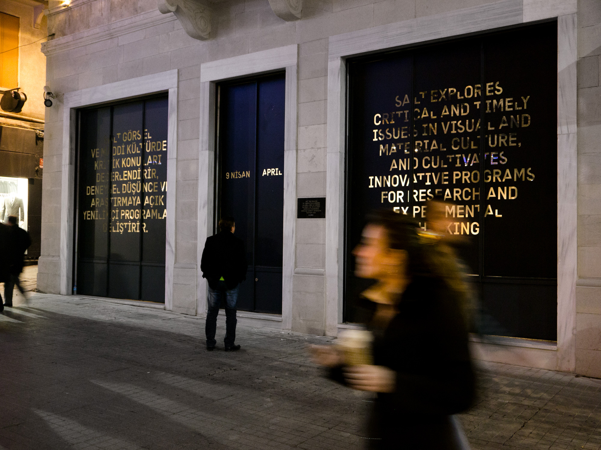
SALT
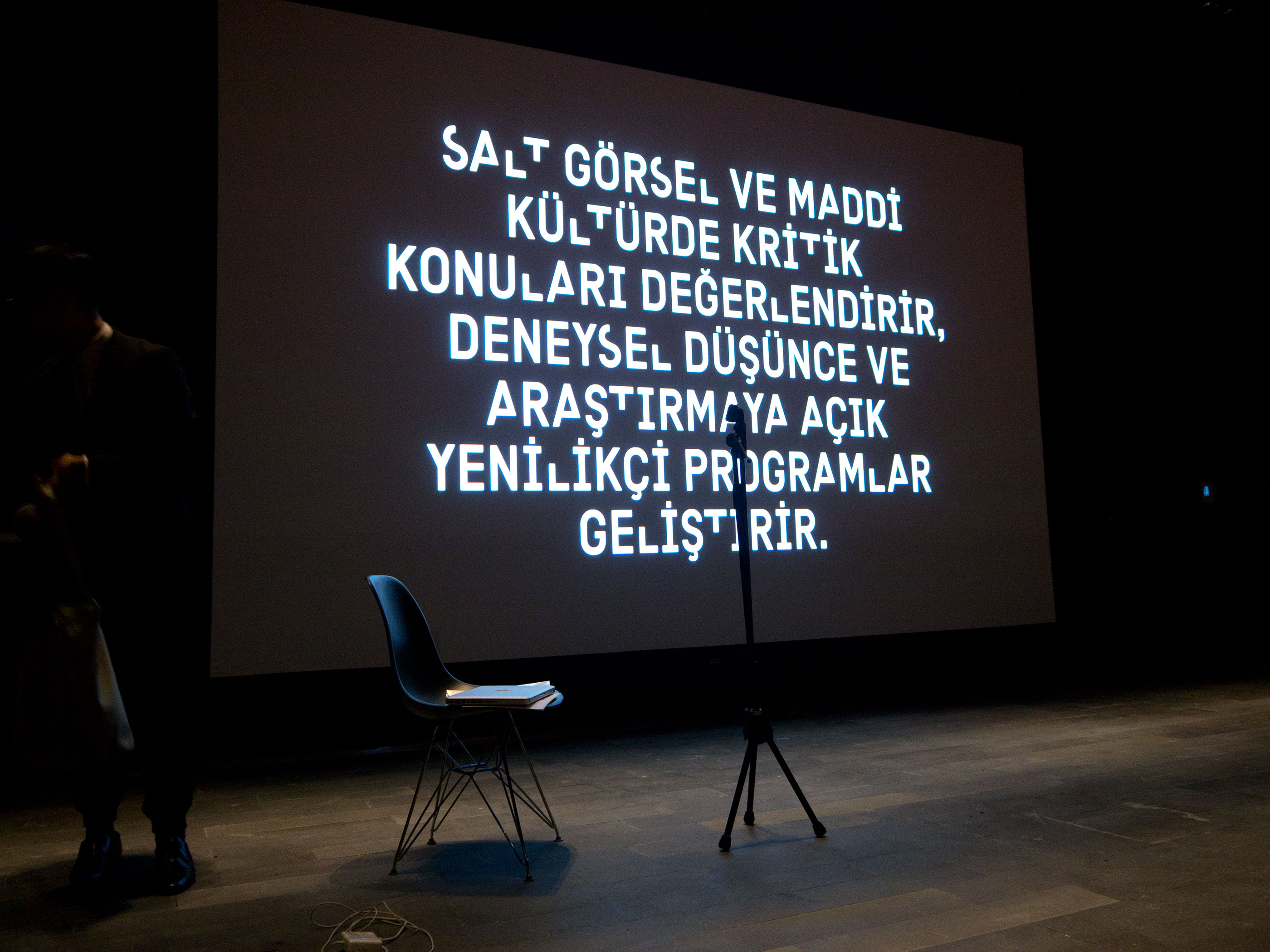
Merging a contemporary art space, an architecture and design gallery, and a scholarly archive, SALT is a new cultural institution in Istanbul that promotes research and experimental thinking—a mission that prompted a meditation on the nature of institutional identity in a world of continuous cultural change.
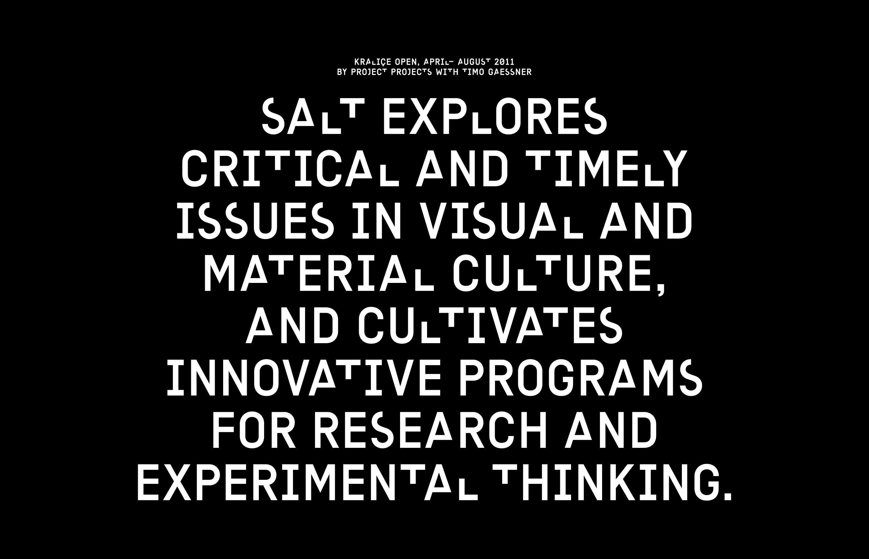
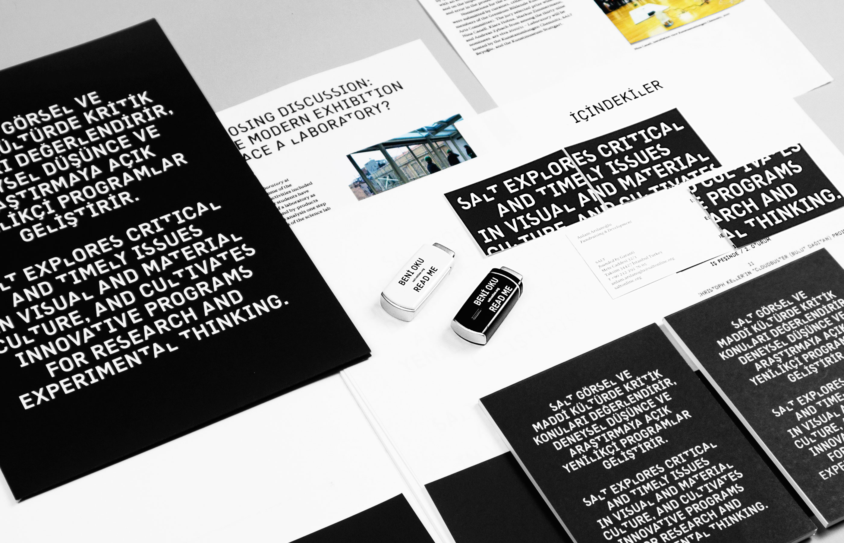
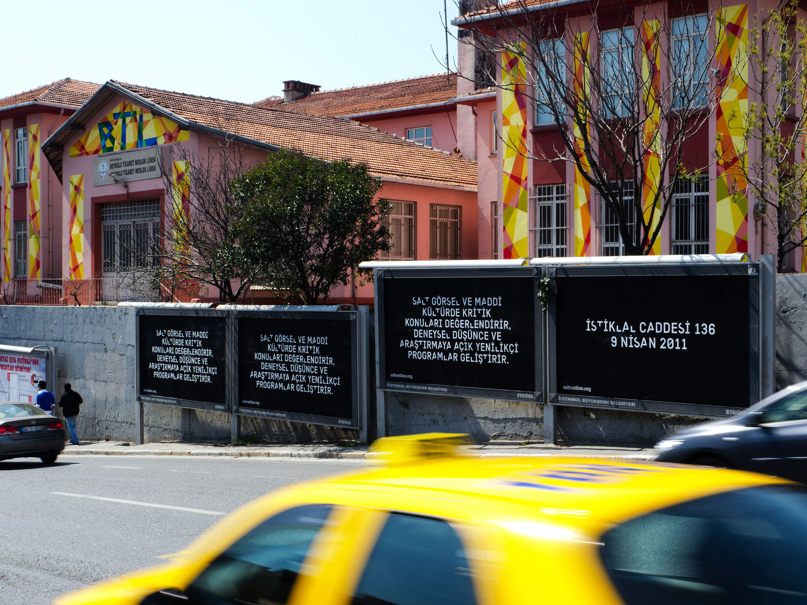
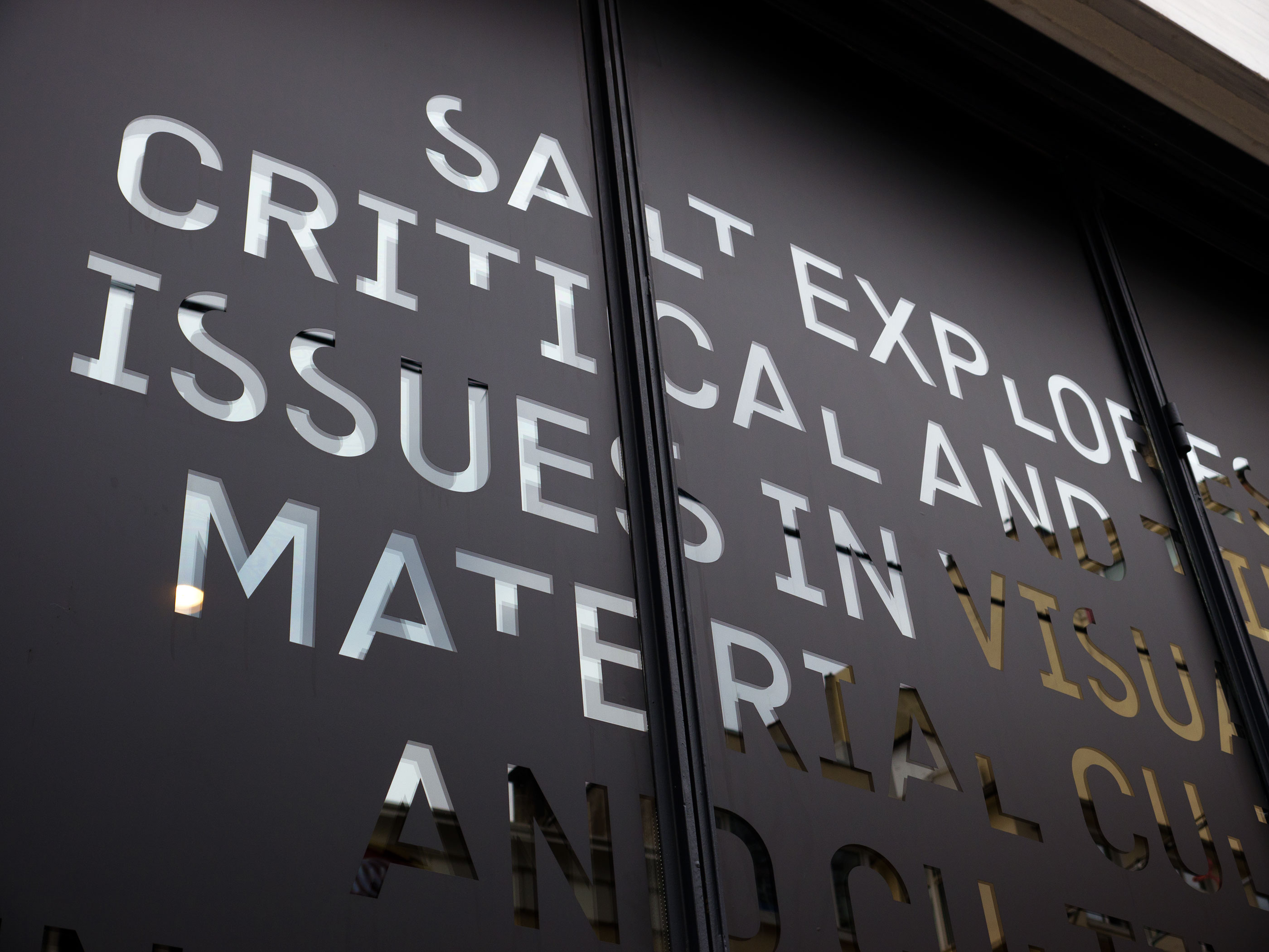
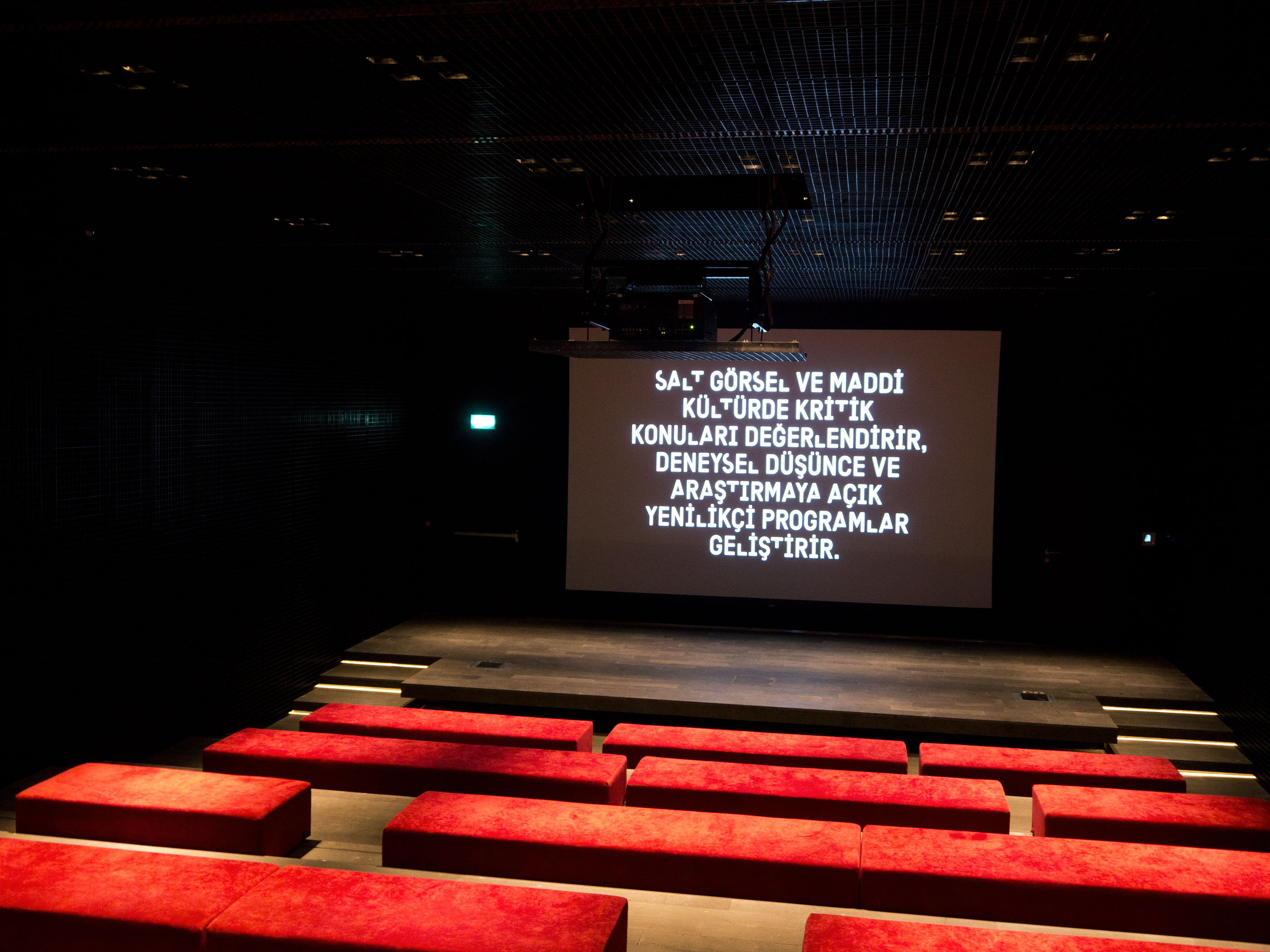
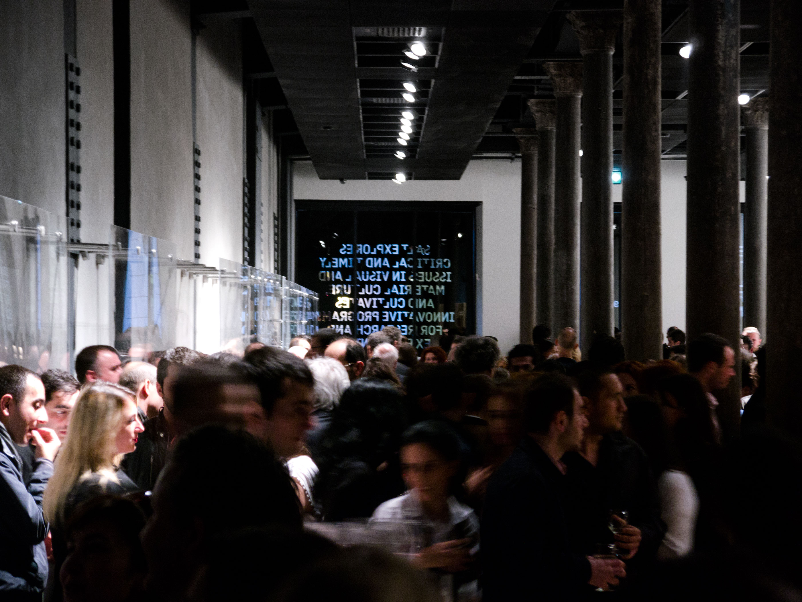
The institution’s name has a unique position within the identity system. The letters S-A-L-T are not represented as a formal logo mark; instead, they are embedded within a custom-designed typeface, Kraliçe, which was created by type designer Timo Gaessner for Project Projects. With this typeface, the institution strategically disperses its name within the language it uses everyday.
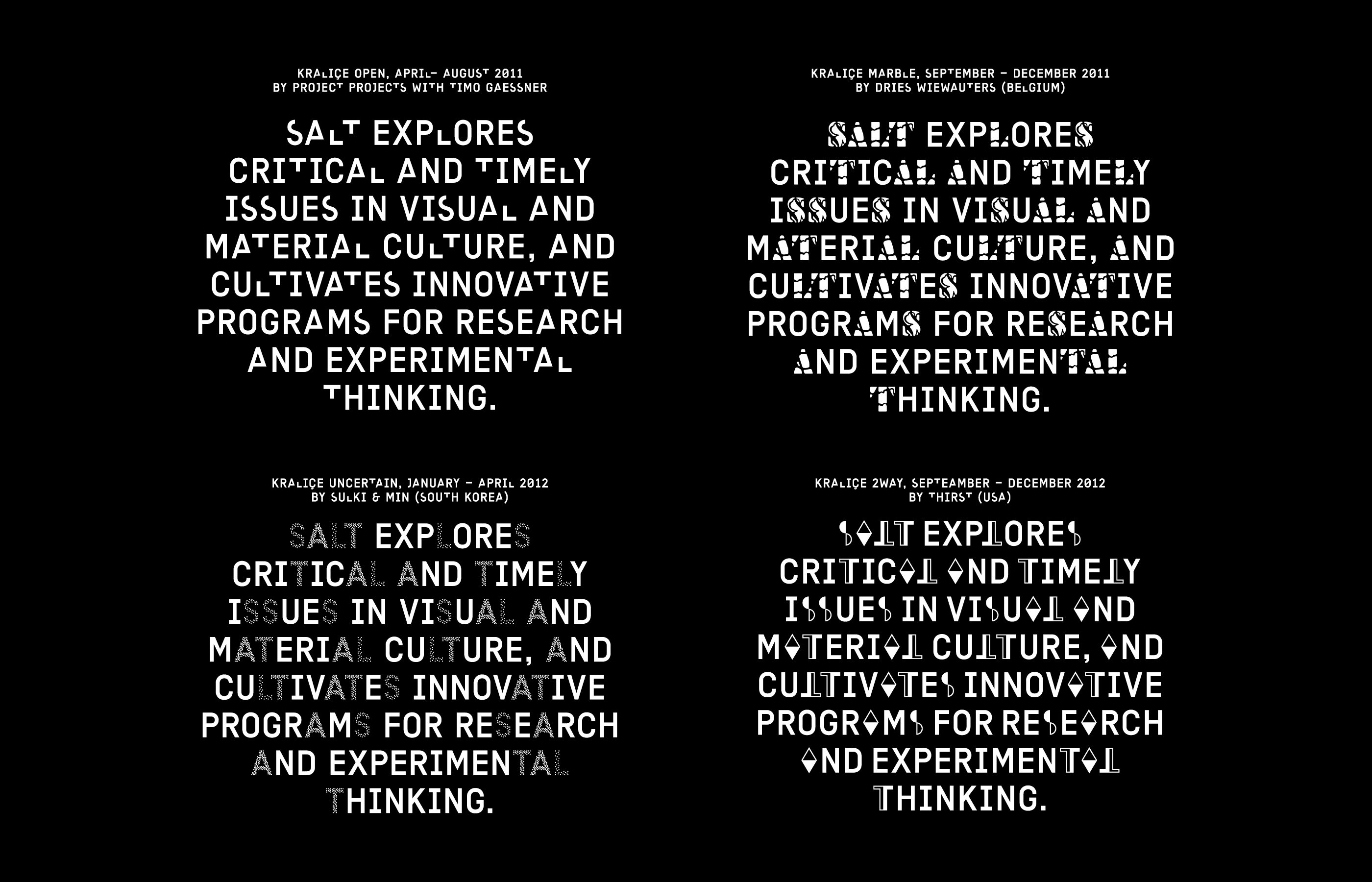
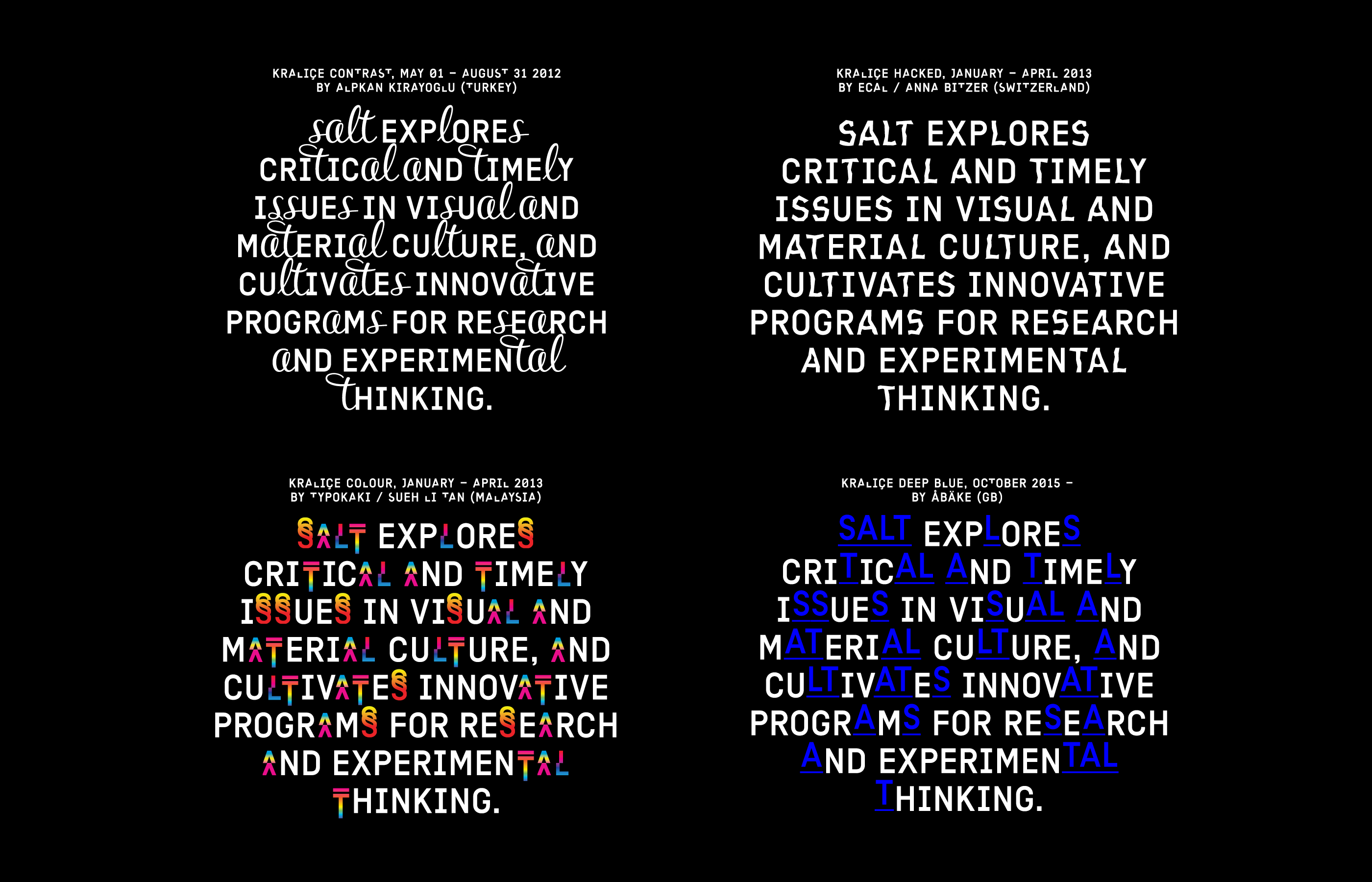
Finally, an ongoing curatorial program initiated by Project Projects takes the identity system itself as a distributed exhibition space. Every four months, a new designer will be invited to reimagine the letters S-A-L-T and thereby modulate the identity’s look across all media. The first designer selected was Dries Wiewauters, followed by Thirst, ECAL/Anna Bitzer, and Abäke among others. In this way the typeface may come to find usages and audiences beyond its original context for SALT.